Kinder Haus
A website redesign for an old fashioned toy store
ROLE
UX Researcher + Designer
TIMEFRAME
2.5 weeks
February 2023
Updated Fall 2023
TEAM
Solo project
TOOLS
Figma, Optimal Workshop, Zoom, Google Slides, Loom
PROBLEM
An old fashioned toy store has a website that's confusing to navigate and doesn't offer online ordering.
SOLUTION
Redesigning the navigation to be consistent, simplified, and self explanatory will help potential customers complete their shopping tasks.

Updated in Fall 2023 with a redesign incorporating
📣 new Figma features announced at Config 📣
Skip forward to the redesign!
OVERVIEW
People born after 1994 have never lived in a world without Amazon
Kinder Haus Toys has been around since 1982, and they’re one of the brick-and-mortar stores that have survived despite the dominance of Amazon.com.
Kinder Haus Toys storefront
They’re an old fashioned store in Arlington, VA, that sells children’s products like toys, books, and clothes. As the sole UX designer and researcher, I redesigned their website to update it for the current day where stores like this have to compete with Amazon.
When I first explored their website, I thought the biggest issue by far was that you couldn’t order anything online. There was a section that looked like an online shop but was actually just a store preview.
This looks like an online shop, but you can’t order any of the products!
When I first explored their website, I thought the biggest issue was that you can’t order anything online. There was a section that looked like an online shop but was actually just a store preview.
I also noticed that some of the main navigation links had misleading names, and sometimes they disappeared when you navigated to another page.
Do customers care whether a small, local store offers online ordering? I designed a usability test to see how shoppers would feel about not being able to order online and whether the website’s navigation would make sense for a first-time visitor.
RESEARCH
How do potential customers feel about not being able to order through the website?
I conducted 5 usability tests over Zoom and asked all participants to complete the same 3 tasks.
Task 1: Purchase a toy under $15 for a 4 year old child
Task 2: Find the “Battle Buckets” toy and compare the price to Amazon.com
Task 3: Find the curbside service page
One person described their reaction to the overwhelming colors and misleading navigation labels:
The participants struggled with basic navigation of the website. When they finally reached the product page and found out they couldn’t even buy it online, it was infuriating.
Almost half of all the tasks were abandoned because the testers felt too frustrated. None of the participants completed all 3 tasks.
THE PROBLEM
The navigation is so frustrating that shoppers abandon their tasks
Quotes from testers while they navigated the Kinder Haus website
User 1 was so frustrated with the navigation during the first task that for the second task, they just opened Google in a new tab because that was an easier way to find specific products and pages than using the Kinder Haus website itself.
But because Google has sponsored results, the first thing the tester saw was other websites that are selling the same toy for cheaper. The first result was from Target, and they’re selling the same toy for almost $14 cheaper than Kinder Haus!
A Zoom screenshot of User 1‘s browser while they use Google to search the Kinder Haus website
User 1 also used Google to complete the third task and this time, the first actual search result wasn’t even from the Kinder Haus website — it was from Amazon. Having a website that’s difficult to navigate was literally driving potential customers to their competition!
It became clear that the number one priority was redesigning the navigation to be consistent, simplified, and self explanatory. The second priority would be to set up online ordering.
THE SOLUTION
Simplifying the navigation for a more intuitive experience
To redesign the navigation, I needed to find out how shoppers expected to see the website’s information organized. After asking card sort participants to organize the existing webpages into categories, I narrowed it down to 3 basic ones:
Online Store
About Us
Customer Support
Then I conducted 2 closed card sorts to see if participants would sort the webpages into those 3 basic categories the way I expected.
I sketched ideas for the homepage with a focus on simple navigation and turned them into Figma wireframes along with additional pages.
Sketch of the redesigned homepage and the resulting Figma wireframe
Wireframes of the redesigned homepage, product list page, and product detail page
PROTOTYPE
Making the toys easier to find
With my prototype, I focused on making the navigation clear and simple because the usability tests showed me that even if I added online ordering to the existing website, shoppers would still be so frustrated by the navigation that they might abandon ship before they even get to the checkout stage.
To help me figure out what prototype features to focus on, I created personas using data from my usability tests and designed a task for each of them.
Primary and secondary personas
Natasha’s prototype task was to find the newest LEGO Thanos toy and look up the rest of the new LEGO Marvel toys. Lucy’s task was to search for dinosaur toys and find one suitable for a friend’s 3-year-old son.
A Figma prototype showing Natasha and Lucy’s tasks
CONCLUSION
Making it easier for customers to support Kinder Haus
During the usability tests for the existing design, participants were frustrated that the website was making it difficult for them to support a local business.
Participants who wanted to support Kinder Haus but were frustrated by the website
Even with navigation issues, potential customers can tell that Kinder Haus has something special to offer.
Shoppers can tell that Kinder Haus has something special to offer
Kinder Haus doesn’t have to be able to go toe-to-toe with Amazon. We just need to make it easier for people who already want to support local businesses and expand on the customer base that Kinder Haus has built over the past 40 years.
UPDATED FALL 2023
Revisiting the funhouse
After Figma announced new advanced prototyping features at Config 2023, I revisited this project to learn how to use variables, conditions, and expressions.
In the original usability tests, 4 out of 5 participants mentioned feeling overwhelmed by the existing website- there were too many colors and moving elements. With the redesign, I focused on just 2 colors: red and gold. These were drawn from both the original website and the physical store’s awnings.
3 out of 5 usability tests mentioned the old logo was difficult to read, so I chose a more legible typeface.
The original design (left) and my updated redesign (right)
I wanted the redesign to show that the store sells modern toys in addition to old fashioned ones, because right now it’s hard to tell unless you look through their photo gallery. But the photo of the brick storefront is still front and center to demonstrate the shop’s nostalgic charm.
This is an updated take on Natasha’s prototype task to find the newest LEGO Thanos toy and look up the rest of the new LEGO Marvel toys.
Natasha's prototype task in the updated desktop design
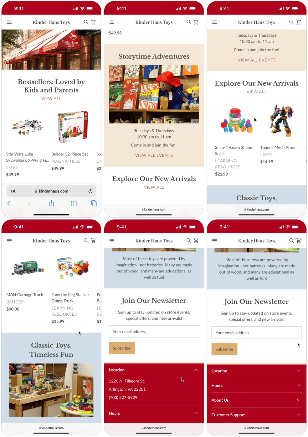
I also made a mobile prototype and adapted the homepage design to keep the page length short, converting the product listings to a horizontal carousel and the footer to an accordion.
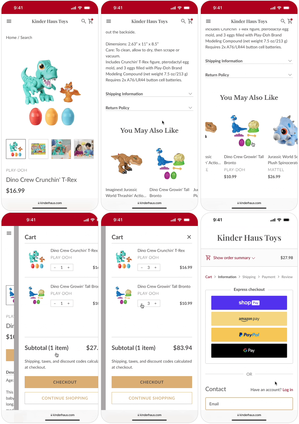
This is an updated take on Lucy’s task to search the website for dinosaur toys and find ones suitable for her friend’s 3-year-old.
I used Lucy’s shopping cart to learn Figma’s new prototyping features. The toy prices and subtotal are variables used within expressions, so they’re automatically calculated and updated as the quantities change.
I also used conditional variables on the +/- signs to prevent the prices and totals from becoming negative numbers.
I recreated Shopify’s standard checkout process as extra practice with variables. On the “Review and pay” page, the shipping and taxes are variables so that the final total is updated automatically.
The initial research and design process for this project are some of my favorite memories from studying UX design, so I had a lot of fun revisiting Kinder Haus Toys to learn new Figma features!


